
Circuit
Implementing a corporate design system
PROJECT
Circuit Design System
Client
Legrand North America
Roles
UX Designer
Deliverables
-
User Research
-
User Interface Concept
-
Functional Prototype
-
Final Presentation
Challenge
Creating a family of products
Overview
Throughout the years, Legrand North America has aquired roughly seventy different companies and therefore roughly seventy different brands. In order to create a sense of consistency across products and rom one unified identity, the central marketing department set out to develop a corporate design system to establish a consistent look and feel across all of our products.
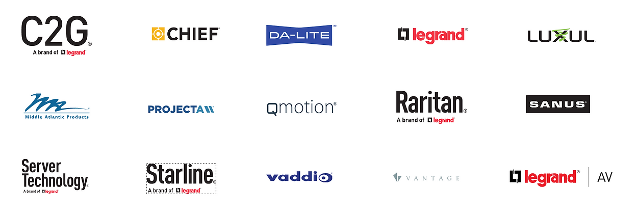
Examples of a few of the brands that I worked with during this implementation

Introducing Circuit
Legrand North America's Corporate design system
This design system contains a style & pattern library for:
-
Colors (including endorsed brand colors)
-
Typography
-
Iconography
-
Atomic Design components (atoms, molecules, and organisms.)
Implementing the design system
As part of implementing the newly established design system across business units. I was placed on several product teams to help drive the transition. After presenting to one of my product teams, the team's reaction to moving towards this new graphic identity was less than ideal. The general consensus was that they didn't need such a system, as they had their own.
I went back to my manager and director for advice on how to best handle this delicate situation, they suggested that if they didn't want to go along willingly, we would get the right people involved to MAKE it happen.
Not wanting to start this working relationship off on the wrong foot, I decided to take a different approach and began looking for specific opportunities where transitioning to the new design system would benefit the team and product.
High Fidelity
When Opportunity Knocks
During a sprint planning session, a concern surrounding accessibility came up about how customers were complaining that some of the elements within our charts were not very distinguishable from one another. The elements clearly did not meet accessibility contrast standards, opening the company up to potential liability.
I saw this as an excellent opportunity for me to share with the team the benefits of using the new design system, after explaining that we had already done the research and made sure the color patterns and elements had met accessibility standards. I went ahead and created a few mock-ups of what the product would look like if we were to make the transition.
Before
After
Retrospective
How do you eat an elephant? One bite at a time.
Considering the massive scope of transitioning to a new design system, the team agreed to slowly opt into the new look by first tacking their issues with chart contrast, before moving on to other areas. This way we could start laying the foundation of the new style while responding quickly to the most urgent issues.
Take-aways
You attract more bees with honey than with vinegar: By sharing the benefits of why they would want to transition to the new design system and letting them make the decision instead of forcing the idea upon them team, we were not only able to bring the brand into alignment with the larger Legrand brand, more-so I was able to establish a solid working relationship with the team for future endeavors.