
Artemis Workbook
Solving the right problem to improve reporting workflows
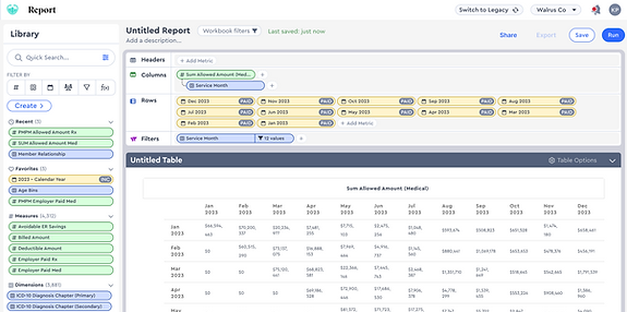
Old Data Table Experience
New Data Building Experience

Overview
Solving the Right Problem
This case study tells the story of how we turned a request to "fix exports" into an opportunity to deeply improve analyst workflows. By digging beneath the surface, we uncovered the real friction and delivered a solution that reduced report creation time by over 70%.
Timeline
Nov 2024- May 2025
Team
UX
Product
Engineering
Analytic Advisors
Approach
By reframing the challenge, we were able to deliver a solution that significantly improved efficiency for our analyst users and rebuilt trust in our reporting tools.
Constraints
-
Limited backend engineering support
-
No design system reference for new components
The Problem We Were Asked to Solve
Leadership wanted exports to match the UI
Leadership initially came to Product/UX with a seemingly straight forward request: improve the quality and consistency of our export options. Excel, PowerPoint, and PDF, so they would better match what users were seeing in the UI.
Customers were frequently frustrated with the exports requiring heavy rework to align visually with what was in the app. This created trust issues and consumed a lot of time.
In-app UI
PowerPoint Export
Reports exports didn’t match what analysts saw in the platform. Inconsistent formatting caused confusion, rework, and mistrust
Export Utilization
To better understand export behavior, I analyzed usage data in Userpilot. Excel and CSV accounted for more than half of all exports, prompting an important question: why were users relying so heavily on raw data? That insight helped sharpen our focus and led us to dig deeper into analyt's workflows.
The Problem We Discovered
It Wasn’t Just the Export, It Was the Workflow
When we dug into user workflows, we uncovered that analysts were spending approximately 50% of their time outside Artemis.
They weren't just frustrated with the output; they were fundamentally limited by the platform's ability to structure data the way they needed.
They often had to export partial tables and stitch them together elsewhere to meet report requirements.
Roughly 50% of analysts time was spent outside our platform editing reports.
To better understand where our exports were falling short, we asked analysts to share examples of the reports and deliverables they were regularly creating. This surfaced key limitations in our current tool.


No way to nest or group key dimensions, More complex builds required external tools like Excel.
Our current Platform only supports 2 date ranges; 3+ are often required
Ablility to insert breaks & calculate subtotals
“I usually export, then clean up the data in Excel or PowerPoint before sharing.”
-Becca S.
Analytic Advisor
We needed to fix the data-building experience first

Framing the Opportunity to Leadership
We presented our findings to leadership and made the case that fixing exports without addressing the data-building limitations would not solve our users' core pain points. We proposed a shift in focus:
'Enable analysts to build the exact tables they need within the platform first.'
Once data construction is solved for, export formatting becomes a much simpler and more effective problem to tackle. Leadership was receptive and aligned around a phased approach.
-
Phase 1.Workbook Building Experience
-
Phase 2. Report Building & PPT Export
Applying the Discovery
We started with wireframes and Figma prototypes to validate layout and interaction.
The goal: give analysts full control to build the tables they need quickly!
The design drew inspiration from familiar BI tools like Tableau, Domo, and Adobe Analytics, balancing power with ease of use.

🔍 Quick search & filter
Quickly surface any metric, measure, dimension, or filter from one search bar—no more digging through nested menus.
↕️ Fully customizable structure
Easily rearrange, or nest metrics however you want.
💡 No limit on date comparisons
Risk Mitigation
Test Early, Test Often
We tested our hypotheses and designs using low investment, high return Figma prototypes which we had our key personas complete essential workflows.
The image shows one of several flows that were validated and used to learn.

Proceed with Caution
Our Figma prototype confirmed we were headed in the right direction, analysts appreciated the flexibility to build tables in-app.
But every analyst approached the task a little differently: how they searched, the order they selected metrics, what they grouped together. Figma couldn’t accommodate that level of variability or account for every possible workflow.
To simulate those real-world edge cases, we needed something more dynamic.

But there was a problem: Our backend engineers were fully allocated to other high-priority initiatives, and a production-ready prototype was still months out. We needed a faster way to validate the experience.
Vibe Coding
Using AI to Bridge the Backend Gap
To explore feasibility, test usability, and gain early insights before backend integration, I used Lovable AI to build a fully interactive prototype of the Claims Lag report (a common, high-value use case) for field testing using mock data.

By building a coded prototype, we uncovered Interaction patterns that static prototypes wouldn’t reveal:
-
How users searched for and named metrics
-
Preference for dragging and dropping metrics in the configuration panel vs. the table
-
Expected behaviors around nesting metrics
Prototyping in code gave us real insights that static designs just couldn’t reach.
Time to Build Report: ⏱️ Cut by 70%
Avg completion time from 9.1 minutes ➡️ 2.5 minutes for building claims lag report
We measured the impact of our new approach by testing how long it took analysts to create reports in ourprototype versus the current system. The average time to complete the report dropped from 9.14 minutes to2.5 minutes. This huge time savings came from eliminating the need to export incomplete tables and manually piece them together in Excel. Analysts could now complete the work entirely within Artemis.
✅ No more stitching data externally
✅ Flexible structure accommodated custom needs
✅ Immediate value, users will be able to export raw data
What I'd do...
Next
-
Once users could create their ideal data structures in the platform, we turned our attention back to exports.With flexible tables in place, we designed formatting tools with end deliverables in mind. We introduced layout previews and customizable options for PowerPoint, PDF, to match the visual clarity of the UI.


Differently
-
Build out more supporting databases in Supabase instead of limiting to a few specific test flows
-
Match the UI more closely to our app (I was prioritizing functionality first)
Outcomes & Value
Delivering Tangible value to Analysts
-
⏳ 70% faster report creation
-
🧪 Tested with users using a functional code prototype to de-risk build
-
🧠 Analysts worked primarily within Artemis
-
🧰 Minimized need for external tools
-
🔁 Established groundwork for future visualizations and exports
Key Learnings
The Problem Beneath the Problem
This project reinforced that real UX progress often starts far upstream. By digging into the "why" behind stakeholder requests, we uncovered a more strategic opportunity than just fixing export formatting.