

OPPORTUNITIES FOR REACHING BROADER INTERFACE TECHNOLOGIES
O.R.B.I.T.
(Senior Capstone Project)
Project
Client
NASA X-HAB
-
Project Manager
-
Experience Designer
Roles
Deliverables
-
User Research
-
User Interface Concept
-
Functional Prototype
-
Final Presentation
The Challenge
Design a virtual, user interface concept for NASA's new lunar station.
Overview
In the Spring of 2019, NASA's X-HAB extended the call to Universities to help come up with viable solutions to challenges facing NASA's new lunar station (the Gateway.)
For the first time in its history, X-HAB included an opportunity for designing a user interface. The challenge, it has to work autonomously as the station will not always be manned.
Approach
Integrate mixed reality into the user interface in order to provide crew members with the ability to view live data and control operations upon the station's modules remotely.
We broke our project down into three separate but cohesive portions.
1. In Module Display (for crew members on the Station.)
2. HOD - Heads up display (Crew members out of Station.)
3. Ground Support Display (for ground control back on Earth.)
THE SIGNIFICANCE

In using mixed reality headsets every person involved with the expedition would have direct access to all of the information they would ever need in real-time, whether they are on the moon, back on Earth, or on the Gateway outpost itself.
Mission Safety
Live Data in
Real-Time
Mission Effeciency
Reduce training time and space
Mission Effectiveness
Universal Integration
Research
Because the Gateway doesn't exist yet, we had to pull data from the ISS (International Space Station) for system specifications and regulations.


Getting up close
and personal.
We gathered information regarding living conditions and system functions from both current and past crew members who worked onboard the International Space Station, as well as engineers working for NASA and Space X.
Information was pulled from both online sources and by personally reaching out to these individuals.
Brainstorming


We began on the white board to come up with solutions for how we were going to organize so much information in a simplified manner and how we were going to display this type of information in a virtual space.
We completely mapped out each system we will be focussing on within the Habitat station, including water management, thermal, power and atmospheric.
Flow & Navigation
Site Map
We followed a similar layout to that of a website to help map out our information architecture. As a default the home screen will be for the module you are currently located in, however, from this screen you will be able to access data and controls for each of the other modules by simply sorting through tabs. We believe this will help aid with navigation and also cut down on the need to swipe through multiple screens and windows.

Wireframes & Prototyping
The first thing we wanted to do was clean up and simplify the user interface, while still maintaining and displaying the most pertinent information.
The top left tier was used for personal information, almost like a (schedule), and the top, right tier was for messages including email, and video chats.
While the bottom portion was reserved for each of the Station's different systems (water management, atmosphere, etc) We utilized tabs as a means for navigating through the systems without having to shift through multiple screens in order to do so.
We also decided to keep a consistent screen across all three platforms (module, visor, and ground control) thus cutting down on training time and the disconnect associated with using different screens.

Test and test again.
We built our ideas out into a low-fidelity prototype. We began by creating user tasks in order to test the flow.
-
Check the capacity of the black tank in the water management system.
- Request a video chat with ground support
- Check the oxygen level in the Main Cabin.

Visiting NASA'S Marshall Space and Rocket Center, Huntsville, AL
In Oct, 2019 we had the privilege of visiting Marshall’s Space and Rocket Center in order to discuss our project and to gather feedback on our designs.
While there we were able to visit with an engineer currently working on the SLS (as part of NASA's Artemis project) and tour prototypes for the deep-space Habitat station. This was incredibly helpful in offering us some validation that we were moving in the right direction with the project The trip also served as a source of inspiration on how we might tackle some of the problems we were already running into.


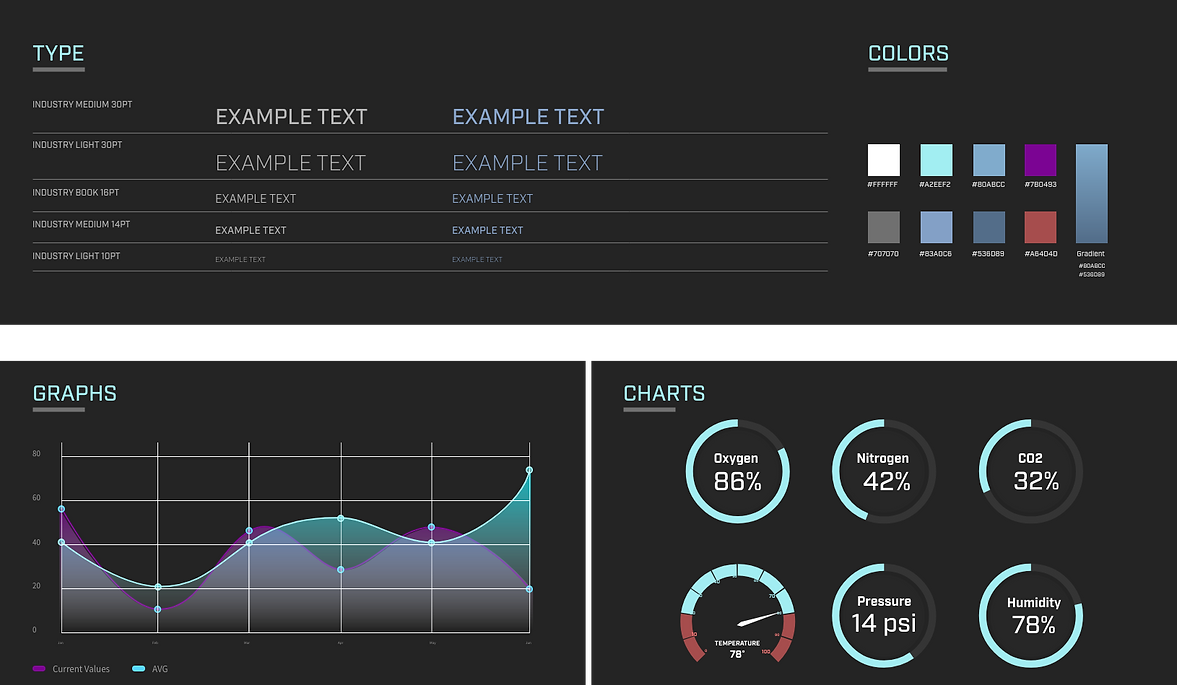
Style Guide
High Fidelity
Broaden you Horizons (Literally)
One of the first things we noticed once we started testing in the virtual headset was just how small and busy the screen seemed to be, making it difficult for users to read and select the buttons they wanted.
We tried increasing the size of the interface but found that this created discomfort for the user, who would have to continually look up in order to view the screen as a whole.
That's when it occurred to us, why not take advantage of the technology at our fingertips? Why limit ourselves to one screen? We were thinking in terms of the physical realm, when in a virtual one the world is literally your screen.
So instead of compiling all the information into just one screen, we decided to break it up into several, all controlled by a heads up display located at the bottom.
We saw an immediate drop in unintentional errors, and an improvement in both legibility and in the amount of time it took someone to complete any given task.
Before

After

Development

Jumping into Unity
We chose to build out our prototype in Unity because it seemed to be one of the best developing tools for the Quest (the VR headset we would be using).
Unity also seemed to have a fairly simple entry point which allowed our team to learn the program while building out our designs. No one on our team had any experience with Unity before jumping into this project which led to some frustrations early on in development.
Product Launch
3...2...1...
Launch
During the middle of testing and development, the global pandemic of Covid-19 hit and put an immediate halt in our progress. We would have to work together remotely, limiting our testing of the headset to just one person.
Development was broken down into individual pieces and dispersed throughout the team. Communication and trust became absolutely essential for us to finish the project on time.
Retrospective
Break out of your own head, and think outside of the box.
As a designer, you have to be able to break out of your own head and question your original assumptions to a user's problems. This is easier said than done, but what I learned is that this is absolutely essential to solving the heart of the problem. You need to be able to approach a problem from many different angles, troubleshoot, and sometimes even scrap an idea all together and start again.
I enjoyed working on this project and collaborating with my team to find an innovative solution to a difficult problem. Conducting extensive research, and continually testing helped keep us focused on our goals. We wanted to provide an autonomous interface, while also experimenting with something new. We ran into a couple road blocks along the way but we met all of those challenges head on and I'm proud of that.