
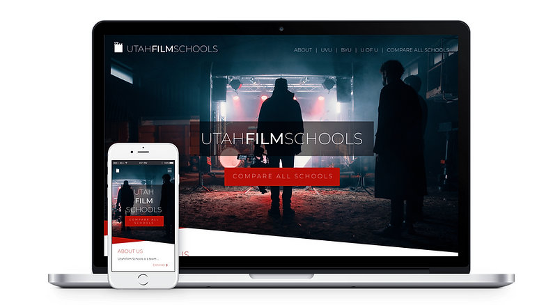
UTAH FILM SCHOOLS
UX Design Portfolio
Project
Circuit Design System
The Challenge
Creating a family of products
FOCUS
User-Experience Design
SERVICES
UI/UX Design, Prototyping, User Research
CLIENTS
Various Industries
Utah Film Schools
Project
Client
Dennis Lisonbee
UVU Professor
Team
-
UX Researcher
-
UI Designer
-
Experience Designer
Roles
Deliverables
-
User Research
-
Surface Compositions
-
Functional Prototype
-
Key Note Presentation
THE CHALLENGE
Build a website that will help promote UVU's Digital Cinema Program.

To view the Invision prototype, click here.
PROBLEM
Professors in the cinematography program don't believe the current state of the website accurately depicts the actual status of the program and fear that it may even hinder prospective students from registering with the program.
APPROACH
Design a simple yet elegant website that provides the visitor with all of the information they are looking for upfront so that they can make an educated decision about the program.
The main goal of the original site was to bring more students into the Digital Cinema program.
RESEARCH
To further help us understand how to approach the design of the site, we conducted a brief online survey through our own personal networks on selecting a college program. Here are the results:
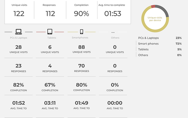
HERES WHAT WE LEARNED
-
Survey participants were most often either enrolled in or graduated from college.
-
The most important information when considering a school was the programs that school offered, not the alumni or the professors.
-
The mobile website will serve a critical role in bringing students into the program.
What information do you find most important when considering a program?
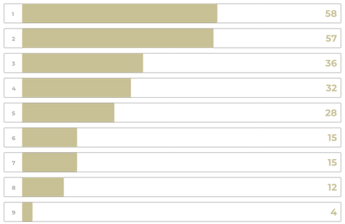
Available Programs
Proximity
Available Classes
Credentials
Transferability
Other
Professors
Alumni
Closest Beach
It isn't enough to say we design for prospective cinema students, who is this really for?

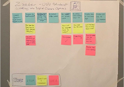
PERSONAS
We created personas to represent our main user groups.
1.Prospective students still in high school or recently graduated. (see Xander left)
2.Prospective students currently enrolled college but not in Digital Cinema.
3.Parents of the above individuals (its common practice in Utah for parents to register their kids for school due to a cultural phenomenon where young adults leave for extended periods of time on service missions).
MAPPING OUT THE JOURNEY
By creating a scenario map of our persona (Xander) we were better able to understand what type of steps he might take to complete a specific task. Using multi-colored post-it notes we outlined examples of Xander's steps, questions, comments, and ideas.
DESIGN
Give the people what they want.
We designed the landing page to be simple, in order to permit users easy access to the information they were looking for regarding the program, including academic advisors and the program's course catalog.
A CTA (call to action) was used both at the start and end of the landing page in order to help achieve the client's primary goal of collecting prospective student's contact information. This way they could reach out to individuals who had expressed interest in the program. (Email address was priority).

THE PIVOT
WHERE IT ALL WENT WRONG, OR SO WE THOUGHT...
Halfway through the project, we ran into a major stumbling block, on the day we were set to present our designs, our client informed us that due to legal complications with UVU, he would no longer be able to support the scope of the project as it currently was. The project was nearly dismissed on the spot. However, through tact and strategy, we pushed the project through and reworked our old designs to accommodate the necessary legal obligations.

A new site map was created, one that wouldn't require users to have to navigate through several different pages to get to their desired content. Instead they would be able to reveal the content as they pleased and at their own pace.
RE-FRAMING
We repurposed our old wireframes to accommodate for the new site and used them as a template for the new pages.

Working with our developer we were able to design a layout that would respond to any screen size.
HIGH FIDELITY
We redesigned the landing page to be simpler and to permit users to quickly see the information they were interested in.

MOBILE
From the research, we conducted from the beginning we knew the importance of designing for mobile.


In order to give the developers on my team a better understanding of how the website should look and function, a prototype was created using Invision.
To view the most up-to-date mobile prototype, click here.
To view the desktop prototype, click here.
RESULTS
The ability to adapt to change quickly is an invaluable trait to have in UX.
This project has served an invaluable role in my development as a designer not because it worked out in the end but because it almost didn't. It required that we make adjustments to our original scope, work through complex problems while meeting tight deadlines and most importantly maintaining the solid relationships I shared with my team members and clientele. This isn't my most recent project but I share it because I have drawn upon the lessons I have learned from this project more than any other.